Showing posts with label Group. Show all posts
Showing posts with label Group. Show all posts
Tuesday, 13 January 2015
Monday, 12 January 2015
Final design for Ancillary task
We have chosen to combine our individual ideas for our final digipack.
 This is the front cover of our digipack; it was designed by Matt. It is a representation of da Vinci's Vitruvian man. We took two photos of Matt- one standing with his feet together with his arms straight out to the side and the other with his legs separated and his arms raised up.
Juliette then edited the photos using GIMP 2 to remove the back ground and then added the 'sketch'.
We have included the bands logo (bottom right hand corner) to help the audience to link the album to the band. This is a common digipack convention because it is essential for the audience to be able to quickly recognise new albums form the band/artists they like.

This is the inside front cover of our digipck; it was designed by Juliette. It is a picture of the band performing- taken during a filming session. This picture shows the audience what the band looks like and links the album to the music video. The reflection effect has been used to represent the idea of reflections and mirror images used in our music video.
 We have chosen to also include some information about the band because this is their first album so the audience will need to know more about the artist. Telling the audience that the band are from London allows the audience to relate to the boys because they can see that they are just normal people who enjoy performing music.
 We have written this page of acknowledgements because it is a common digipack convention. We have written it in a friendly register to show that they band are appreciative of the help they have received. We have continued to use a dark background so that the white text stands out which draws the audiences attention to it.
 This is the CD tray for our digipack; it was designed by Bruna. It uses an image of Matt walking, we took this picture against the green screen and Juliette edited it to remove the background and add a 'sketch' effect.
Matt is walking around the CD in an endless circle to represent the themes of the CD- loneliness and struggle.
The pattern created by his feet joining, is aesthetically pleasing and makes the CD look more interesting.
 This is the back cover of our digipack; it was designed by Juliette. It uses the silhouette of a bird in flight to link to the theme of freedom which is sought-after by the artist in our music video.
The names of the other songs in the album where created by Juliette and Bruna, after making a list of possible album titles to unused titles were used for the songs.
We have used the front cover of our digipack in our magazine advert.

Juliette then edited the photos using GIMP 2 to remove the back ground and then added the 'sketch'.
We have included the bands logo (bottom right hand corner) to help the audience to link the album to the band. This is a common digipack convention because it is essential for the audience to be able to quickly recognise new albums form the band/artists they like.
This is the inside front cover of our digipck; it was designed by Juliette. It is a picture of the band performing- taken during a filming session. This picture shows the audience what the band looks like and links the album to the music video. The reflection effect has been used to represent the idea of reflections and mirror images used in our music video.
Matt is walking around the CD in an endless circle to represent the themes of the CD- loneliness and struggle.
The pattern created by his feet joining, is aesthetically pleasing and makes the CD look more interesting.
The names of the other songs in the album where created by Juliette and Bruna, after making a list of possible album titles to unused titles were used for the songs.
We have used the front cover of our digipack in our magazine advert.
Friday, 12 December 2014
Work is progress photographs of our story boards

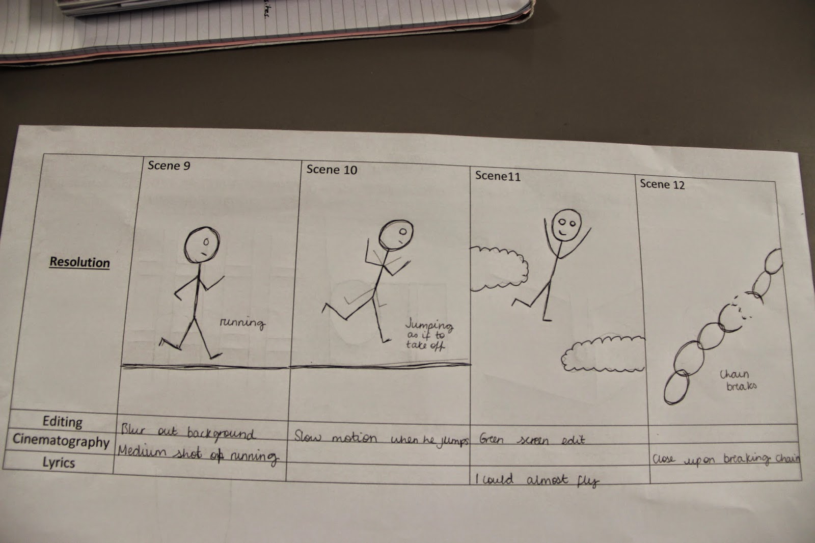
These story boards show our ideas so far, we have listen to the song (Across the Skyline) and taken inspiration from the lyrics and mood of the music. Some of our ideas have been symbolic and some have been literal representations of the lyrics.

We have chosen to include narrative and performance in our video; peer feedback and research has shown us that this mix of music video genres is commonly used by Indie-Rock bands and artists.
Wednesday, 10 December 2014
Music Press Research - MOJO
We looked through a selection of music magazines on Magforum.com looking for a suitable publication for our band. We wanted a magazine that was appropriate for the genre and reflected the band effectively.
We have chosen to use MOJO for our magazine advertisement. This is because the magazine covers a wide range of genres but it encapsulates the indie/alternative style. Here are some examples of previous covers:
We have chosen to use MOJO for our magazine advertisement. This is because the magazine covers a wide range of genres but it encapsulates the indie/alternative style. Here are some examples of previous covers:
 |
| The Smiths |
 |
| Nirvana |
 |
| The Black Keys |
Thursday, 4 December 2014
Chorus Lip-Syncing: Practice and Analysis
What went well?
Shooting the clip was successful as the lyrics were well rehearsed and we managed to film without any problems. As a group we chose a suitable spot for the filming of the video; a wooden background which complimented the Indie Rock feel that we were aiming for, for this reason, we may end up using this in the final video. We found that the pronunciation was correct and we managed to stay in time with the lyrics as the music during the chorus was not too fast paced.
What did not go well?
One of the final lines was very quick so it would be better if we had a backup singer for that line so it would work in time with the music better. Also, it would be better if the performance was dynamic with potentially more people in the shot to enhance the video.
What have I learnt?
The artist should be more aware of the tempo of the music and the lyrics and how they should be sung to do this we need to immerse ourselves within the feel of the music in order to get into character and give a more dynamic performance.
What sections will we lip synch?
We will lip synch the chorus and verses that are not needed for narrative purposes. We’ll be more selective about verses which include backing singers, this will overcome the problem of overcrowding the shot.

Initial title ideas
We have used Wordle to create a representation of our initial ideas for the title of our album.

This is a Wordle of our title ideas.

This is a Wordle of the key terms and phrases associated with our song.
This is a Wordle of our title ideas.
This is a Wordle of the key terms and phrases associated with our song.
Thursday, 27 November 2014
Health & Safety

Above: our set of health and safety considerations. It includes our filming locations, issues that may appear in each location and how to deal with the issues.
Saturday, 22 November 2014
Peer feedback of rough cuts

This feedback sheet shows that we have met most of the criteria to a satisfactory standard. They feel that we have produce very steady shots but we need to increase the binary opposites in our video. We will do this by increasing the amount of narrative in our video so that we can continue our use of binary opposites.
 This feedback shows that we have performed strongly in a majority of the criteria including variety of shot types used, variety of angles used and inclusion of binary opposites. But we didn't perform as highly in our use of a variety of shot movement, framing and semiotics. We will improve in these areas by using more camera movement during the performance sections of our video, taking more time to check the framing of each shot and think about how to include more semiotics.
This feedback shows that we have performed well in some criteria; steady shots, variety of shot angles and framing, But we have not performed as well in the other criteria including variety of shot type and variety of shot movements. We can improve these scores by, like above, increasing shot variety and movement.

This feedback shows we have performed well in the top 4 criteria, including shot type and movement. But we need to improve the framing in our shots, semiotics and binary opposites. We can do this by, like above, taking time to checking the framing of our shots, including more semiotics and binary opposites.

This feedback shows that we have performed well in all of the criteria and very well in one criteria- our variety of shots. This shows that so far we have created a varied and interesting video.

This feedback shows that we have performed well in a majority of the criteria including steady shots, shot variety and framing. But there is room for improvement in the shot movement, we can do this by using more movement. We also need to improve on our use of semiotics and binary opposites, we can do more research and planning into these criteria to find inspiration.


This feedback shows that we have performed well in two criteria, steady shots and framing. But we need to improve on the other criteria including variety of shot type and shot movement. We can do this by trying out different and interesting shot types and movements.

This feedback shows that we have performed well well with our variety of shot type and angles.
We could do work to improve the shot steadiness by increasing our use of the tripod. We have performed less well in the other criteria including shot movements and framing. We can improve in these criteria by increasing our use of movement but ensuring that the shot is steady and we should take time to check the framing of each shot.

This feedback shows that we performed well in just over half of the criteria including shot angles and movement. But we need to improve our framing, semiotics and binary opposites. We can do this by checking the framing of each shot, increasing semiotics used and adding more binary opposites.

This group feedback board shows that our peers felt that we used a good variety of shots, had good content, had a good balance between narrative and performance and high quality editing technique.

This group feedback shows what our peers feel needs to be improved. They felt that we needed more footage that's linked by a running theme, more binary opposites needed, develop narrative further, speed up some narrative shots, move boxes from behind curtain in performance shots (framing) and use more close ups.
Friday, 21 November 2014
Locations

Narrative:
Cars and people in the town center, we will use footage shot in town during the narrative parts of our video to display the setting our artist is in.

Narrative:
House, this is the first location in the video. It shows where the artist starts his journey.

Narrative:
High street, this town location contributes to the themes and narrative in the video.

Narrative:
Merrow Downs, this remote location emphasis themes and narrative in our video.

Performance:
Drama Studio, this location suites the performance parts of our video. We can use spot light to create an intimate feel to the shots.
Sunday, 9 November 2014

Friday, 7 November 2014
Sunday, 26 October 2014
Props list
Shoes: the dark coloured shoes will draw the audiences attention to the artists feet, especially when his feet are seen running or walking. This represents his journey, and longing to escape.
 Music player: This will be used at the begining of the video to show the artist pressing play to start the music. This will create a direct link between the music and visuals and this follows Goodwin's rules.
 Instruments: We will be using a four piece band to be in keeping with the song. We will use a microphone, Electric Guitar, Bass Guitar and Drum kit.

Costume, make-up and hair planning
Costume:
The costume worn by our artists (Matt 1) during the narrative parts of our music video will be dark colours, heavy material and layers. He will wear a zipped up dark jacket and dark trousers- this represents his isolation and entrapment.


The costume worn by our artists (Matt 1) during the narrative parts of our music video will be dark colours, heavy material and layers. He will wear a zipped up dark jacket and dark trousers- this represents his isolation and entrapment.
Matt 2 (free Matt) will wear white/light clothes to represent his freedom.
Make-up and hair:
Because our artist is male, we will not be using fashion make up or extravagant hair styles. We may experiment with using make-up to make Matt 1 look pale/ill when he is isolated and tormented by his mind; where as Matt 2 will not wear make-up because he will look healthy and strong because he is free. We would not use as much make-up as the image below, but it is a idea that we can work from.
Wednesday, 15 October 2014
Deconstruction of Lyrics

Using wordle allowed us to identify the key words in the lyrics, this enables us to know what ideas and concepts to focus on when creating our music videos. For example, the words 'disorder', 'feel' and 'pain' show that the lyrics are very personal and meaningful which means we will need to show that in our music video for it to be successful. We could do so by using close-ups on the artist to show his emotions as well as lip syncing, we could also film and edit in such a way that the idea of pain and disorder is illustrated (e.g desaturated to show pain, fast paced or disoriented shots to convey disorder). The words 'window' and 'world' inspire the idea to use windows and reflections. 'World' could also suggest just the artist's normal life and routine, so perhaps shots of towns and people going about their routines could work well. 'Dust' and 'across' inspire the idea for a shot where the artist stamps on the ground and cause dust to fly across the shot. Another example would be the matching the word 'skyline' with a panning or normal shot of a skyline, or simply including the shot of a skyline in out music video to relate to the lyrics.
Examples of words that appear often are, as can be seen in the wordle; dust, disorder, window, skyline, world, pain, feel, across etc.
Tuesday, 14 October 2014


Saturday, 4 October 2014


Friday, 3 October 2014
Pitch: Analysis and Feedback

This first feedback form shows that we have met our peer's expectations fully on our choice of song, our ideas for mise-en-scene and also our choice of record label.
It shows that we may need to increase our research into and analysis of our target audience; this could be done through research into our target audience's expectations of the Indie Rock genre.
It also shows that we need to spend more time analysing the lyrics of our song (Across the Skyline) and develop more detailed and specific ideas for the narrative of our music video.
Lastly it shows that we need to add more detail to our editing ideas; we need to include more detail
on the transitions and visual effects that we may use.

This second feedback form shows that we have met a majority of our peer's expectations fully on all but one of the categories.
It also shows that we need to spend more time developing our narrative ideas.

This third feedback form shows that we have met our peer's expectations fully on our choice of song and we have met their exceptions almost fully in most of the other categories (similarly to the first form, we need to add detail to these categories).
It shows that we need a lot more work on our narrative ideas; we will need to look at our lyrics, the codes and conventions of the Indie Rock genre and our audience's expectations in order to develop detailed narrative ideas.
The key feedback we have taken from this peer evaluation is that we definitely need to work on our narrative ideas and we may need to add some more detail to other areas including target audience and editing.
Subscribe to:
Posts (Atom)