
Showing posts with label Album. Show all posts
Showing posts with label Album. Show all posts
Monday, 12 January 2015

Final design for Ancillary task
We have chosen to combine our individual ideas for our final digipack.
 This is the front cover of our digipack; it was designed by Matt. It is a representation of da Vinci's Vitruvian man. We took two photos of Matt- one standing with his feet together with his arms straight out to the side and the other with his legs separated and his arms raised up.
Juliette then edited the photos using GIMP 2 to remove the back ground and then added the 'sketch'.
We have included the bands logo (bottom right hand corner) to help the audience to link the album to the band. This is a common digipack convention because it is essential for the audience to be able to quickly recognise new albums form the band/artists they like.

This is the inside front cover of our digipck; it was designed by Juliette. It is a picture of the band performing- taken during a filming session. This picture shows the audience what the band looks like and links the album to the music video. The reflection effect has been used to represent the idea of reflections and mirror images used in our music video.
 We have chosen to also include some information about the band because this is their first album so the audience will need to know more about the artist. Telling the audience that the band are from London allows the audience to relate to the boys because they can see that they are just normal people who enjoy performing music.
 We have written this page of acknowledgements because it is a common digipack convention. We have written it in a friendly register to show that they band are appreciative of the help they have received. We have continued to use a dark background so that the white text stands out which draws the audiences attention to it.
 This is the CD tray for our digipack; it was designed by Bruna. It uses an image of Matt walking, we took this picture against the green screen and Juliette edited it to remove the background and add a 'sketch' effect.
Matt is walking around the CD in an endless circle to represent the themes of the CD- loneliness and struggle.
The pattern created by his feet joining, is aesthetically pleasing and makes the CD look more interesting.
 This is the back cover of our digipack; it was designed by Juliette. It uses the silhouette of a bird in flight to link to the theme of freedom which is sought-after by the artist in our music video.
The names of the other songs in the album where created by Juliette and Bruna, after making a list of possible album titles to unused titles were used for the songs.
We have used the front cover of our digipack in our magazine advert.

Juliette then edited the photos using GIMP 2 to remove the back ground and then added the 'sketch'.
We have included the bands logo (bottom right hand corner) to help the audience to link the album to the band. This is a common digipack convention because it is essential for the audience to be able to quickly recognise new albums form the band/artists they like.
This is the inside front cover of our digipck; it was designed by Juliette. It is a picture of the band performing- taken during a filming session. This picture shows the audience what the band looks like and links the album to the music video. The reflection effect has been used to represent the idea of reflections and mirror images used in our music video.
Matt is walking around the CD in an endless circle to represent the themes of the CD- loneliness and struggle.
The pattern created by his feet joining, is aesthetically pleasing and makes the CD look more interesting.
The names of the other songs in the album where created by Juliette and Bruna, after making a list of possible album titles to unused titles were used for the songs.
We have used the front cover of our digipack in our magazine advert.
Thursday, 18 December 2014
Album Design Art Ideas
When coming up with some ideas and design concepts for our album's art I wanted to hark back to some of the key features of our band and specifically the song that we were covering. As an indie rock band doing things by the book and being part of the status quo just isn't an option, this is why I wanted to try and help make our album unique. I wanted it to stand out and make the viewer think about it for a few moments. Over the course of this blog post I will outline why I chose some of the artistic ideas that I came up with.
Front cover
 |
| The Front Cover |
The circular design around the two figures is also taken straight from Da Vinci's illustration and it's inclusion shows once more that the figure is trapped within a sort of bubble almost. The main theme of course is that feeling of being trapped which I feel has been expressed in a variety of ways with
this album cover design.
Inside panels and disc
 |
| The Front and Back Inside Panels |
The disc design is deliberatly blank to reflect the individualism of indie rock and the band itself. Fans of indie rock and indie rock artists don't conform and they don't buy into brands and labels. I believe that making the disc blank shows that feeling and reflects it effectively.
The background of the entire inside is also again deliberately a single colour. This is to contrast with the white of the disc to make it stand out but to also allow the birds to fit into the design on the left-hand-side. The birds are shown in the design flying off into the distance which relates to some of the lyrics within Across the Skyline and the name of the song itself. The song itself features the word skyline which has a connection to birds which we incorporated into our music video and which also features in the song. The lyrics "bitter the bird that flies" are reflected with these birds on the inside panel of my album design. The idea behind incorporating them within the album is that they signify freedom, which is something that our character doesn't have. This contrasts with the front cover and I believe forces the audience to think for a few moments about the meaning.
Back cover
 |
| The Back Cover |
The back cover of my design is again playing on the idea of being trapped and again focusing on our clearer character. The man is shown pushing up against the border between him and the song names list. The song names list is irrelevant to the image of the man but the border between them is not. It signifies a wall or a barrier. This barrier is trapping him and he is shown pushing with all of his strength trying to remove it. This again relates back to the concept shown in the previous designs and the theme of the song. The contrast of white on black makes it stand out visually and it fits in with the theme of the rest of the album design.
I haven't come up with any song name ideas to fill the list with at this stage and the text below the man shown with the lines is showing the credits and some extra detail we will be including. The barcode on the right of course is very recognisable and it's just a common feature of albums so I decided to incorporate it within my design idea.
Saturday, 13 December 2014




Friday, 12 December 2014
Album Art Design Ideas

I have used colour- purple and blue. These are deep, dark colours which represents the pained and longing feel of the song.
The birds flying across the page link to the lyrics "bitter the bird that flies", we have included footage of birds in our video and including birds in the CD cover will link it to the song and lyrics.
The houses that I've drawn on the waves of colour represent a skyline through the eyes of our tormented artist. It creates confusion and disorientation.
I have also drawn pictures associated with our artist, I have drawn gritted teeth and a desaturated field scene with our artist standing in the middle. This link of our music video and would show the audience who the artist is.
The chain hanging down the centre of the page links to the themes of restriction and entrapment. Chains could be used on the CD cover as accessories or as a physical restraint trapping our artist.
My initial CD cover designs:

This is my design for the front cover.
The artist is in the centre of the page, he is wearing a dark jacket and dark trousers. The chains will be around the artist's wrists restraining him, holding him down. There will be chain hung in the top corners of the cover to emphasise the themes of entrapment -these could be digitally added.
There will be one light source illuminating one side of the artists face and body. This will make the artist stand out but also symbolically represent his inner struggle to be free.

This is my design for the inside front cover.
It will be a photograph of the whole band. Whilst filming we took photos of the band performing so that they were acting naturally. Using a photo of the band will help the audience to associate the band with the song and the album. Because the photo was taken during the filming process it will directly link the album to the music video. This could increase the number of views/downloads of the music video because the photo of the band will show the audience that we have created a music video to accompany the album.

This is my design for the inside back cover/CD.
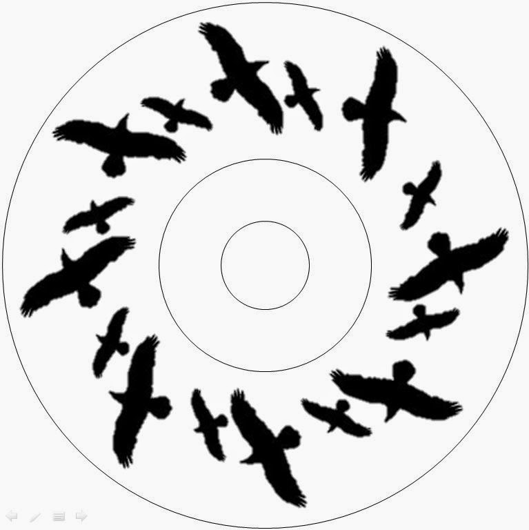
The CD will have images of birds printed onto it, they will all have one wing pointing into the centre of the CD and the other wings pointing outwards. There will be around 6/7 birds on the CD arranged in a circle. This will link the album directly to the lyrics in Across the Skyline- "bitter the bird that flies". This should increase the lasting impact of the song making it more memorable.

This is my design for the back cover.
It includes birds again. The titles of the songs in the album will be moulded along the line of the birds wings. This creates an aesthetically pleasing effect and it is memorable. The use of birds will again link to the lyrics "bitter the bird that flies", but birds also connote freedom and space. These connotations contrast dramatically with the front cover of the CD which represents entrapment and suffering.
Magazine Album Advertisment Analysis

The target
audience for this artist and the advert are males and female, early-mid 20’s.
This is shown through the use of a black and white image filter, this shows
that audience who the artist is but it doesn’t focus on his ‘star image’; this
effect is suitable for his audience because they will be buying his album for
the high quality music not because of his celebrity status or image.
The sketched
drawing on the front of the album is a child-like impression of the artist Joe
Zeffa. This ‘character’ has been used in the advert, he is hiding behind the
artists shoulder, and this may link to the mood of the album. The music may
include themes such as loneliness- this is indicated by the sketch of the
artist being alone on the CD cover, the songs may also use themes of longing
for companionship and friendship- this is indicated by the sketch being behind
Zeffa’s shoulder, it could be seeking protection or company.
The advert
highlights the artists name and the album title, this has been done to make the
audience create a link between the artist and his debut album. The title of the
album ‘After the Cake’ is quite obscure, unless the song focus on food and cake
the title does not reveal much about the content of the album. Zeffa’s
pre-existing audience know his style and understand any references that he may
be making in this title. If somebody has not heard his music before, this tile
may seem odd or random, this could make this new audience interested and
intrigued and want to listen to the album to find out the hidden meaning. But
it could just confuse them and make the album less appealing.
This is a
full page advertisement; this makes sure that the audience can easily see this
advert. Because no distinct colours are used the greyscale colour scheme will
stand out against the bright colours on the other pages surrounding it.

Because the
album cover has been put into the advert, the audience will know what the cover
looks like if they plan to buy it in a shop. The advert also states that the
album is available to download form his website, this is ideal for the
early-mid 20’s audience who use a lot of technology in their everyday life and
increasingly for music.
Half of the
artist face is shown; he has a stubble beard and shaggy hair. This is his image
which his target audience will recognise but he is not relying on his image to
attract this audience. At the very top of the advert it says “Manchester born”,
this represents his roots and background. It shows that he is a normal, inner
city man who has found success; his audience may feel that this makes him a more
down-to-earth and honest person, who they can relate to.
The artist’s
logo is large and bold. It dominates the top quarter of the page making it
stand out. This will draw the audience’s eyes to the artist name so that they
know who the album is by and who he is if they don’t recognise him.
Thursday, 11 December 2014
Album Analysis - Nirvana, Nevermind
The massively popular grunge rock group Nirvana released the groundbreaking album, Nevermind in 1991. It ushered in a new era of rock and music in general with the hit single Smells Like Teen Spirit taking the chats by storm for the many years that followed. In this post I will analyse the album and highlight the underlying message of it's strange and vivid artwork.
 |
| The front cover of Nirvana's 1991 album Nevermind |
Initially the name of the album was set to be Sheep, which was a subtle joke created by Kurt Cobain directed at the people that would be buying the album. In the end however, Cobain grew tired of the name and settled on Nevermind as it as a metaphor for his attitude on life in general and that it was grammatically incorrect.
The typography of the name of the album, Nevermind, is written in a way that almost reflects water shimmering and bending. The name of the band is written in it's traditional style that is associated with them and that they use on all of their work.
The typography of the name of the album, Nevermind, is written in a way that almost reflects water shimmering and bending. The name of the band is written in it's traditional style that is associated with them and that they use on all of their work.
The album cover features a baby boy in a bright blue pool who is seemingly chasing a $1 bill that's on a fish hook. The artistic idea behind the image came from Cobain who had been watching water births with his fellow band member Dave Grohl. Cobain thought that it would symbolise how even at birth a person is chasing money, they're always after it. The nakedness of the child shows innocence and purity, this is enforced by the clearness of the pool and it's vivid blue colour. This idea of innocence is reinforced by the concept that the water is a associated with baptism.
Cobain wanted to create a memorable image that would challenge the business ideas of the time. The entire concept is a strange one as a baby of course doesn't understand what money is and how currency works. The baby chasing the dollar bill shows greed and avarice that is not possible in a child so young but it signifies how big business manages to reel us all in and have us chasing like fish.
One of the most striking parts of the album is the showing of the young boys penis. There was some concern initially from Geffen who though that if the penis was shown that the album would be received badly. Cobain however thought that it should remain. He refused to have it removed and his only compromise was that a sticker could be placed over the penis that said "if you're offended by this, you must be a closet paedophile".
It could also be said that the penis may symbolise an umbilical cord and that the image of the baby seemingly happy could remind audiences of babies in the womb. The deep blue of the water could signify danger despite it being clear that the baby is near the surface of the water. The deep blue could also however signify peace which relates to the name of the band, Nirvana. The Buddha described Nirvana as "the perfect peace of the state of mind that is free from craving, anger and other afflictive states (kilesas). The subject is at peace with the world, has compassion for all and gives up obsessions and fixations" via Wikipedia.
 The back cover of Nevermind is very different to the front but it follows a similar watery theme. The background is a turquoiise blue that shimmers almost like water. This, like the watery theme on the front cover could symobolise innocence and purity.
The main image is a collage that Cobain made himself. The collage which has a rubber monkey superimposed over the top of it features images from Dante's Inferno paintings, photos of raw beef and pictures of diseased vaginas. Cobain used many of his collages and paintings in Nirvana's art work as he preferred it to what others came up with. Cobain also revealed in an interview that if you look hard enough you can see an image of the legendary rock band, KISS. Just above the monkey's head the band are shown standing on top of a slab of beef. The collage of images could symbolise an internal struggle or just the rebellious attitude that Nirvana had. Shops would have to show these images whether they liked it or not and they wouldn't know what the images actually were.
It could also be said that the penis may symbolise an umbilical cord and that the image of the baby seemingly happy could remind audiences of babies in the womb. The deep blue of the water could signify danger despite it being clear that the baby is near the surface of the water. The deep blue could also however signify peace which relates to the name of the band, Nirvana. The Buddha described Nirvana as "the perfect peace of the state of mind that is free from craving, anger and other afflictive states (kilesas). The subject is at peace with the world, has compassion for all and gives up obsessions and fixations" via Wikipedia.
The main image is a collage that Cobain made himself. The collage which has a rubber monkey superimposed over the top of it features images from Dante's Inferno paintings, photos of raw beef and pictures of diseased vaginas. Cobain used many of his collages and paintings in Nirvana's art work as he preferred it to what others came up with. Cobain also revealed in an interview that if you look hard enough you can see an image of the legendary rock band, KISS. Just above the monkey's head the band are shown standing on top of a slab of beef. The collage of images could symbolise an internal struggle or just the rebellious attitude that Nirvana had. Shops would have to show these images whether they liked it or not and they wouldn't know what the images actually were.
Wednesday, 10 December 2014
Subscribe to:
Posts (Atom)