Friday, 27 March 2015

Matt's Evaluation Question 1
 |
| First screenshot |
First screenshot – Music
to visuals
The first screenshot is a snippet from one of our
performance shots. In the shot the lead singer is shown alongside band members
performing the song in time with the music, so as to look in sync.
This sort of shot is typical of many music videos of indie
rock bands and many other artists and bands. The use of performance in a music
video allows the viewer to see the band’s musical talent, their charisma and
personalities up close.
The emotions of the lead singer can be effectively shown
through performance shots and in this said shot the lead singer is looking deep
into the camera and engaging with the viewer in this manner. This is to both
show his inner pain that is portrayed throughout the video and to connect with
the viewer who will most likely be a fan.
This can also be a great way of representing the band as
they seem talented, very indie and different. This is one of the main features
of many indie rock bands and it is something that record label would definitely
want to see from an indie rock band’s music video. This type of shot can be
seen in the music videos of bands such as Blur, the Foo Fighters and The Arctic
Monkeys. This therefore shows that our video conforms to the indie rock genre
in this aspect.
Our use of this convention also links to one of Goodwin’s
rules, which is that there s a relationship between the music and the visuals.
Second screenshot – Relationship
of lyrics to narrative/visuals
In my second screenshot you can clearly see birds flying in
the sky. This is used when the line, “I could always fly, I could always fly,
bitter the birds that fly” is said.
 |
| Second screenshot |
This is done to clearly show the link between that line and
the feeling of freedom. The birds flying are a symbol of freedom that the lead
singer does not have.
The use of a link such as this is very common in many indie
rock music videos and many music videos in general. Videos from the likes of
Imagine Dragons use features such as this as simple visuals to lyrics linkages
such as this help the audience make connections much more easily. This again
shows how we are using a convention of the indie rock genre.
Our use of this convention also links to one of Goodwin’s
rules, being that there is a relationship between the lyrics and visuals.
Third screenshot –
Setting/location
The third screenshot I am going to focus on is one that
shows the lead singer alone in a field.
 |
| Third screenshot |
This particular shot makes use of the gloomy and foggy
surroundings and really emphasises the feeling that the lead singer is very
alone. The dreary and dismal tone is one that is set throughout all of the
narrative sections, especially on the field.
The gloomy feeling is a common one in many indie rock music
videos, but the use of an isolated rural setting is not. The field was
something that we wanted to utilise, as it was something very different to what
is usually seen in an indie rock video. Most indie rock videos are in urban
areas, our one on the other hand mainly focuses in a more rural setting. For
example, Blur’s music video for Parklife is based in an urban setting.
Our use of a rural setting therefore challenges a certain
convention of the genre.
Fourth screenshot –
Lighting
 |
| Fourth screenshot |
The lighting focuses on the centre, where the band is stood
so that the rest of the room is drowned out in darkness. This makes the
audience focus on the band and them performing, which reinforces the
concentration to the lyrics and visuals and also the subconscious thoughts
about them being talented musicians.
As this is very common in many indie rock music videos, we
can say that we are once more using a convention of the genre to our advantage.
One such example of a band that uses this in their video is Blur. They use a
similar setting and style in their music video for Song 2.
Fifth screenshot –
Representation of the band + record label expectations
In my sixth screenshot the band is shown together performing
the song. This is used to show the band as a talented group, which is something
that record labels would want to be shown in a band’s music video. The use of
lots of close-ups and extreme close-ups, in sections like this force the viewer
to focus on the band members and their instruments, which links the two
together for them subconsciously.
 |
| Fifth screenshot |
Our use of this in our music video shows that we are using a
certain convention of the genre to our advantage. Our use of this convention
also links to Goodwin’s rules, one of which being that the record label that
the artist/band is signed to tend to have a set of demands. They often want
lots of close-ups on the artist/band and a certain recurring style across all
of their work.
Sixth screenshot -
Mise-en-scene
 |
| Sixth screenshot |
The five key areas of mise-en-scene are:
Settings and props
Costume
Facial expressions and body language
Lighting
And the…
Positioning of characters and props
The use of the studio for this shot links them with the idea
of being a talented band. Studios are places that people with talent commonly
perform in and the band are shown in this screenshot as being in a studio by
the instruments, lights on the ceiling, the curtains and the use of previous
shots in the music video. This sort of studio setting is something that Blur
have used, as I have said previously, in their music video for Song 2.
The use of dark and simple costumes that have no recognised
label is something that we wanted to incorporate throughout our music video.
The screenshot I have chosen shows three of the band members, all wearing
black, which fits in with the style we are trying to show. All members of the
band are coordinated together to show cohesion as a unit and to show a sort of
togetherness. The use of dark, unlabelled clothing is something that is
featured in many indie rock bands’ music videos. One such example is the Arctic
Monkeys’ video for why’d you Only Call me When You’re High? In this the main
character is shown throughout wearing dark, almost mysterious clothing just
like we have. This shows that we are conforming to this convention within the
indie rock genre.
In the screenshot the facial expressions of some of the band
members can also be seen, and even their body language. The body language shown
in the screenshot shows them performing, but not staying still and instead
getting into the music. When performing, artists need to show rhythm and tempo
as a person standing stock-still doesn’t give off a good impression of himself
or herself or the music. This is something that a record label would be keen to
see band members incorporate in their music videos as it represents them as a
high energy, enthusiastic and young band. One other band that incorporates
these high-energy performance shots are the Foo Fighters. In their videos for
The Pretender, Something From Nothing, Best of You, All My Life, Monkey Wrench
and Times Like These the Foo Fighters incorporate lots of shots showing the
band performing much like in our video.
In terms of lighting, the screenshot shows that the
spotlight is being focused on the band with the rest of the room being almost
entirely blacked out. This is so that the viewer focuses on the band whilst
they are performing and shows them as the centrepiece of the music video.
Another indie rock music video that incorporates this sort of lighting is in
the song, Good Days Bad Days by the Kaiser Chiefs.
The positioning of the band members is key in this shot, as
the lead singer must be shown in the centre as the main focus point. In this
screenshot the leader guitarist, lead singer and drummer can be seen
performing. Positioning shows cohesion and the fact that the lead singer is at
the front, as the focal point shows him to the viewer as the most important
member. This can bee seen in almost any music video, as the lead singer is 99%
of the time the main focus point. In terms of props, the instruments are the
only props and they are all positioned with each band member, naturally.
Seventh screenshot –
Camerawork and editing
 |
| Seventh screenshot |
This sort of shot isn’t too common in the indie rock genre,
and neither is the use of special effects in this way. Indie rock music videos
tend to be pure and without too many frills almost. Our use of special effects
in this way and the use of a long shot challenges what many indie rock music
videos incorporate.
Eighth screenshot –
Genre of music and how it is defined
 |
| Eighth screenshot |
In many indie rock music videos the lighting, cinematography
and editing is usually low-key and has a specific style to it. The screenshot I
have chosen shows the lead guitarist performing and representing the band much
like is many other indie rock music videos. The style of clothing we chose is
also important as it is laid back and minimalistic, much like in songs by the
Arctic Monkeys and The 1975.
In this respect, we are conforming to the styles of many
other indie rock music videos so as to appeal to a very specific audience.
Ninth screenshot - Influence
of other music videos etc.
 |
| Ninth screenshot |
Another direct influence was the costumes from The 1975. In
their music videos they usually appear wearing very dark, brand less clothing
that links with the indie rock genre.
One final influence was the use of lots of performance shots
and close-ups of the instruments being played. I took this directly from
Nirvana’s Smell Like Teen Spirit. Although it is a grunge rock song I took
influence from it as it showed the great musical talent of the band and forced
the viewer to focus on them performing.
Thursday, 26 March 2015
Wednesday, 28 January 2015
Sunday, 25 January 2015
Evaluation Question 2
Below, Evaluation Question 2, for a larger view visit http://www.gliffy.com/go/publish/image/7032839/M.png

Friday, 16 January 2015
Evaluation Activity 4
How did you use media technology in the construction and research, planning and evaluation stages?
Evaluation Activity 2
How effective is the combination of your main product and ancillary texts?
Click to enlarge

Click to enlarge
Created using Cacoo
Evaluation Activity 1
In what way does your media product use, develop or challenge forms and conventions of real media products?
Tuesday, 13 January 2015
Monday, 12 January 2015

Final design for Ancillary task
We have chosen to combine our individual ideas for our final digipack.
 This is the front cover of our digipack; it was designed by Matt. It is a representation of da Vinci's Vitruvian man. We took two photos of Matt- one standing with his feet together with his arms straight out to the side and the other with his legs separated and his arms raised up.
Juliette then edited the photos using GIMP 2 to remove the back ground and then added the 'sketch'.
We have included the bands logo (bottom right hand corner) to help the audience to link the album to the band. This is a common digipack convention because it is essential for the audience to be able to quickly recognise new albums form the band/artists they like.

This is the inside front cover of our digipck; it was designed by Juliette. It is a picture of the band performing- taken during a filming session. This picture shows the audience what the band looks like and links the album to the music video. The reflection effect has been used to represent the idea of reflections and mirror images used in our music video.
 We have chosen to also include some information about the band because this is their first album so the audience will need to know more about the artist. Telling the audience that the band are from London allows the audience to relate to the boys because they can see that they are just normal people who enjoy performing music.
 We have written this page of acknowledgements because it is a common digipack convention. We have written it in a friendly register to show that they band are appreciative of the help they have received. We have continued to use a dark background so that the white text stands out which draws the audiences attention to it.
 This is the CD tray for our digipack; it was designed by Bruna. It uses an image of Matt walking, we took this picture against the green screen and Juliette edited it to remove the background and add a 'sketch' effect.
Matt is walking around the CD in an endless circle to represent the themes of the CD- loneliness and struggle.
The pattern created by his feet joining, is aesthetically pleasing and makes the CD look more interesting.
 This is the back cover of our digipack; it was designed by Juliette. It uses the silhouette of a bird in flight to link to the theme of freedom which is sought-after by the artist in our music video.
The names of the other songs in the album where created by Juliette and Bruna, after making a list of possible album titles to unused titles were used for the songs.
We have used the front cover of our digipack in our magazine advert.

Juliette then edited the photos using GIMP 2 to remove the back ground and then added the 'sketch'.
We have included the bands logo (bottom right hand corner) to help the audience to link the album to the band. This is a common digipack convention because it is essential for the audience to be able to quickly recognise new albums form the band/artists they like.
This is the inside front cover of our digipck; it was designed by Juliette. It is a picture of the band performing- taken during a filming session. This picture shows the audience what the band looks like and links the album to the music video. The reflection effect has been used to represent the idea of reflections and mirror images used in our music video.
Matt is walking around the CD in an endless circle to represent the themes of the CD- loneliness and struggle.
The pattern created by his feet joining, is aesthetically pleasing and makes the CD look more interesting.
The names of the other songs in the album where created by Juliette and Bruna, after making a list of possible album titles to unused titles were used for the songs.
We have used the front cover of our digipack in our magazine advert.
Thursday, 18 December 2014
Magazine Advertisement Design Idea
 |
| My Magazine Advert Design Idea |
I have also told the reader when the album is out and the name of the album along with the name of the band.
Album Design Art Ideas
When coming up with some ideas and design concepts for our album's art I wanted to hark back to some of the key features of our band and specifically the song that we were covering. As an indie rock band doing things by the book and being part of the status quo just isn't an option, this is why I wanted to try and help make our album unique. I wanted it to stand out and make the viewer think about it for a few moments. Over the course of this blog post I will outline why I chose some of the artistic ideas that I came up with.
Front cover
 |
| The Front Cover |
The circular design around the two figures is also taken straight from Da Vinci's illustration and it's inclusion shows once more that the figure is trapped within a sort of bubble almost. The main theme of course is that feeling of being trapped which I feel has been expressed in a variety of ways with
this album cover design.
Inside panels and disc
 |
| The Front and Back Inside Panels |
The disc design is deliberatly blank to reflect the individualism of indie rock and the band itself. Fans of indie rock and indie rock artists don't conform and they don't buy into brands and labels. I believe that making the disc blank shows that feeling and reflects it effectively.
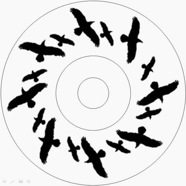
The background of the entire inside is also again deliberately a single colour. This is to contrast with the white of the disc to make it stand out but to also allow the birds to fit into the design on the left-hand-side. The birds are shown in the design flying off into the distance which relates to some of the lyrics within Across the Skyline and the name of the song itself. The song itself features the word skyline which has a connection to birds which we incorporated into our music video and which also features in the song. The lyrics "bitter the bird that flies" are reflected with these birds on the inside panel of my album design. The idea behind incorporating them within the album is that they signify freedom, which is something that our character doesn't have. This contrasts with the front cover and I believe forces the audience to think for a few moments about the meaning.
Back cover
 |
| The Back Cover |
The back cover of my design is again playing on the idea of being trapped and again focusing on our clearer character. The man is shown pushing up against the border between him and the song names list. The song names list is irrelevant to the image of the man but the border between them is not. It signifies a wall or a barrier. This barrier is trapping him and he is shown pushing with all of his strength trying to remove it. This again relates back to the concept shown in the previous designs and the theme of the song. The contrast of white on black makes it stand out visually and it fits in with the theme of the rest of the album design.
I haven't come up with any song name ideas to fill the list with at this stage and the text below the man shown with the lines is showing the credits and some extra detail we will be including. The barcode on the right of course is very recognisable and it's just a common feature of albums so I decided to incorporate it within my design idea.
Tuesday, 16 December 2014
Alterations, Technical Difficulties and Story Board Changes
Above, some of our alterations and changes explained.
Saturday, 13 December 2014




Friday, 12 December 2014
Magazine Album Advertisement Analysis
Below is a magazine advertisement for the indie rock band The Horror's album called Strange House;

An analysis of the magazine advert using MindMeister;
Subscribe to:
Posts (Atom)